From flat and safe – to vibrant and daring!
For a number of years we have been smothered in a flat, albeit clean design landscape – which has definitely stood the test of time,
however 2018 will be the year that we see a shift in attitudes toward what we at Myadd call ‘safe’ design.
We predict that alongside the ever popular minimalism and simplification trends, there will be some newer vibrant spins on older techniques – ensuing a daring mix of bold, vibrant, and detailed harmony puréed amongst contemporary flair.
Below is a shortlist of expected trends that will emerge this year, some old favourites, others an extension on current techniques.
Feast on a handful of the trends we think will be front and centre for 2018.
Responsive logos
The minimalisation and responsive design of logos continues into 2018. As more and more people switch to mobile devices as their primary browsing medium, logos have to continually adapt to to suit these devices, 2018 is no exception.

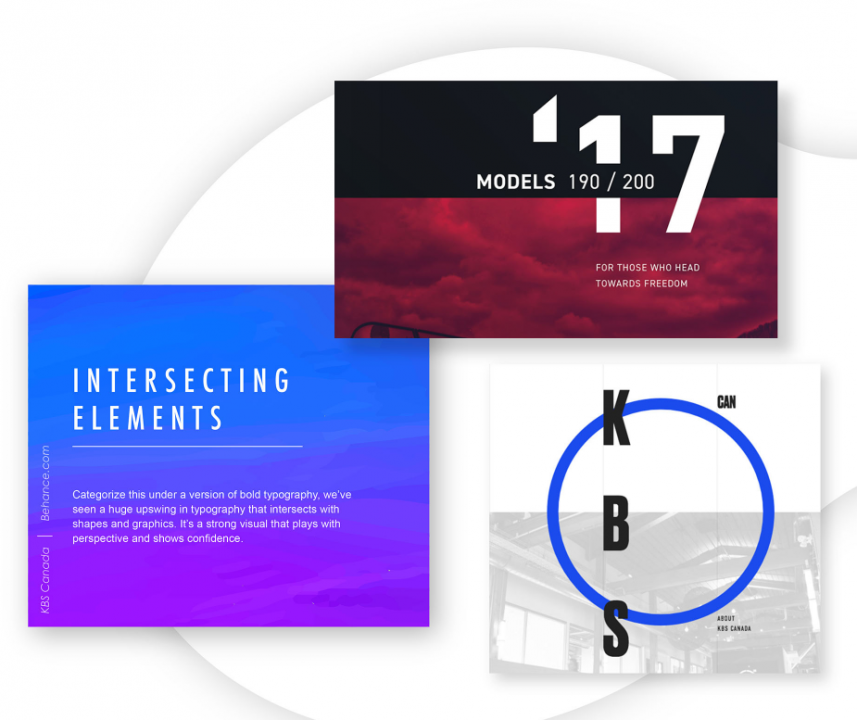
Intersecting Elements
To give you that same feel as bold typography. The use of elements overlapping enhances your perspective and shows confidence.
2017 began experimenting in this space, 2018 will continue this evolution, pushing boundaries a little further.
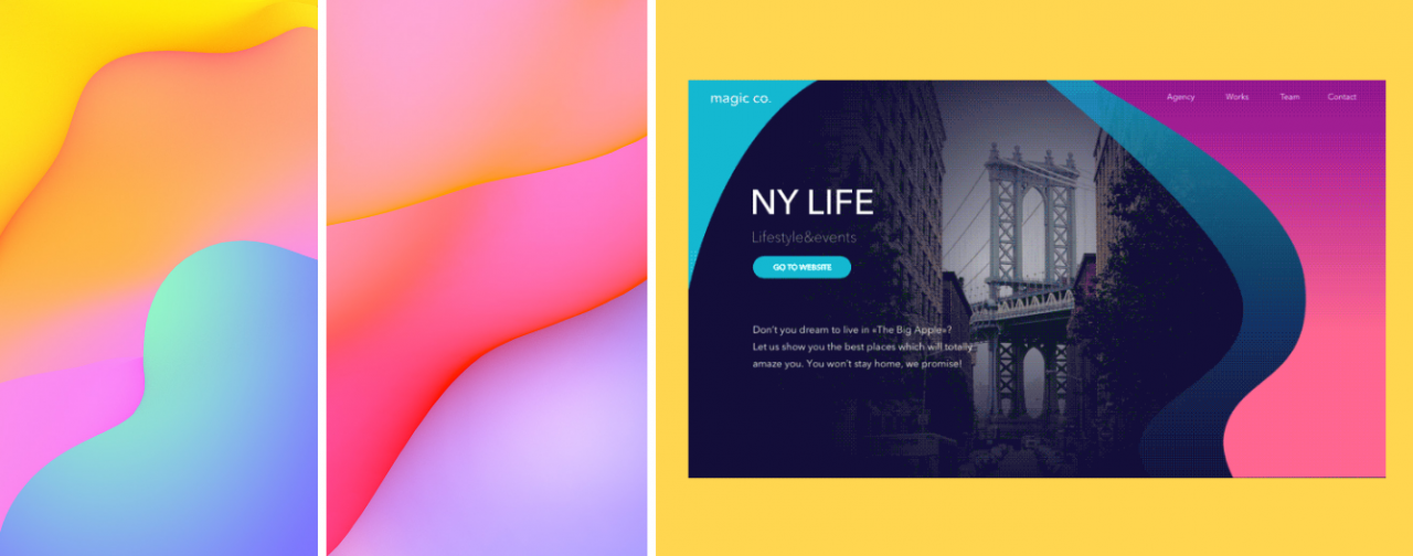
Gradients
Have you noticed gradients slowly creeping into everyday life? Some people call them colour transitions, whatever you call them, they are sliding into 2018 in bright, bold and vivid compositions – and they look great!! Texture and shape will dictate the success of your gradients this year, one way or another it certainly will catch your eye!
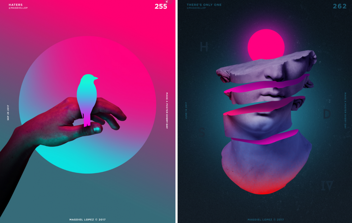
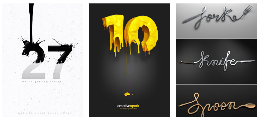
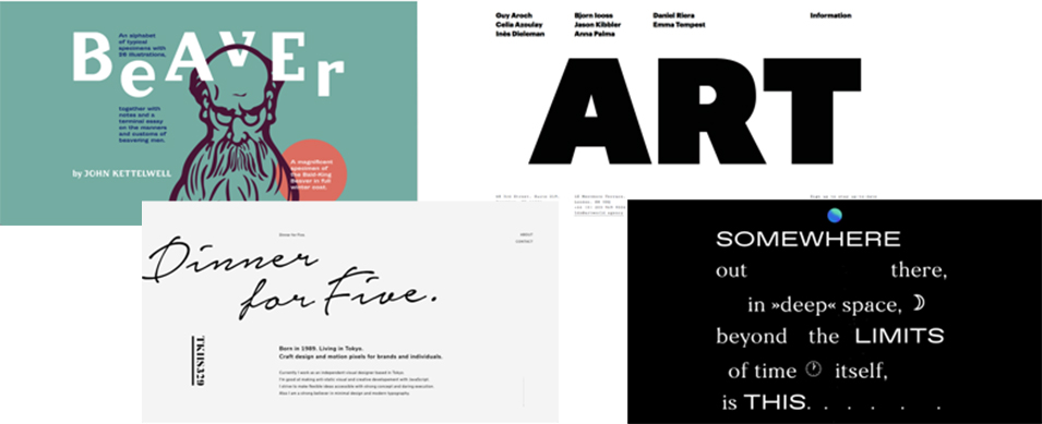
Creative typography
Creative typography continues to place itself in the limelight year after year. 2018 is definitely not going to spoil the creative typographers party. There are so many outcomes achieveable with just the use of shapes and letter form, throw a subtle texture or graphic in the mix and there is virtually no limit to the creative, and eye catching outcomes possible.
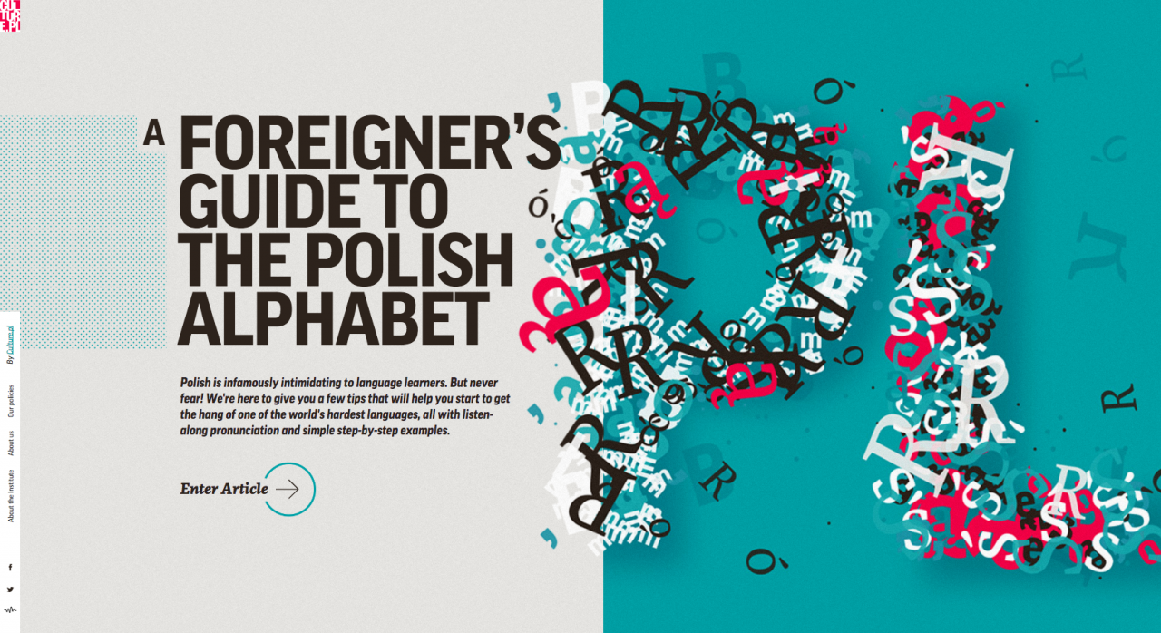
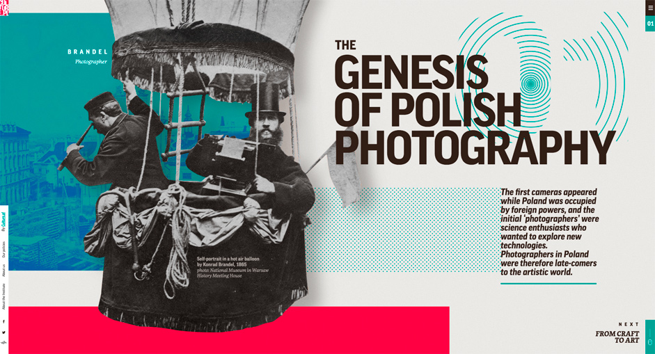
Asymmetric Design
The definition of asymmetry is the lack of symmetry or equality between two halves. It isn’t the lack of balance, which is usually the mistake made by some designers. Beautiful design starts with balance and ends with harmony. Asymmetric design, when done right has power and allure, 2018 will see asymmetric design pushed to it’s beautiful, harmonious boundaries and you will see some amazing looking websites emerge based on this idea…
Highly-detailed vintage

This example is not a physical product, but a digital one. It’s a pack of vintage motorcycle badges that could be used on websites, books, presentations, or for a motorcycle crew to print out the designs and place them on clothing. This style of vintage design is seen in all sorts of industries. For instance, golf and camping companies have similar elements, with the twisting backgrounds, minimal colors, and pencil drawings. Overall, this design says handcrafted and high quality. It’s an example of how you can take vintage products and transform the details into your own designs.
Be sure to lookout for these types of styles this year!